Menu Close

Tag: #Powerappsblogs

Design Model Driven App or Canvas App with Page Design types from Maker Portal

Hello Everyone,

Today i am going to share new page design types available on Maker Portal.

This blog post gonna be Part 1 of this series.

Lets gets started.

Login into www.make.powerapps.com

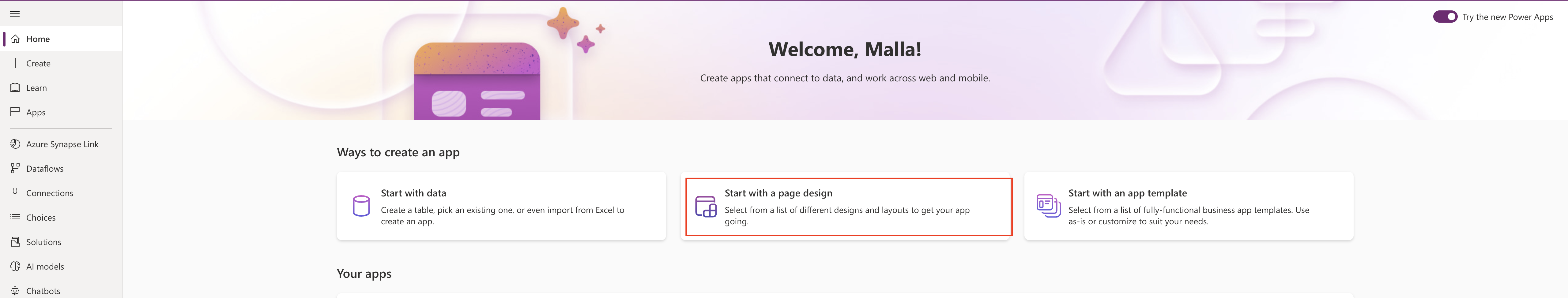
Then choose the Page Design.

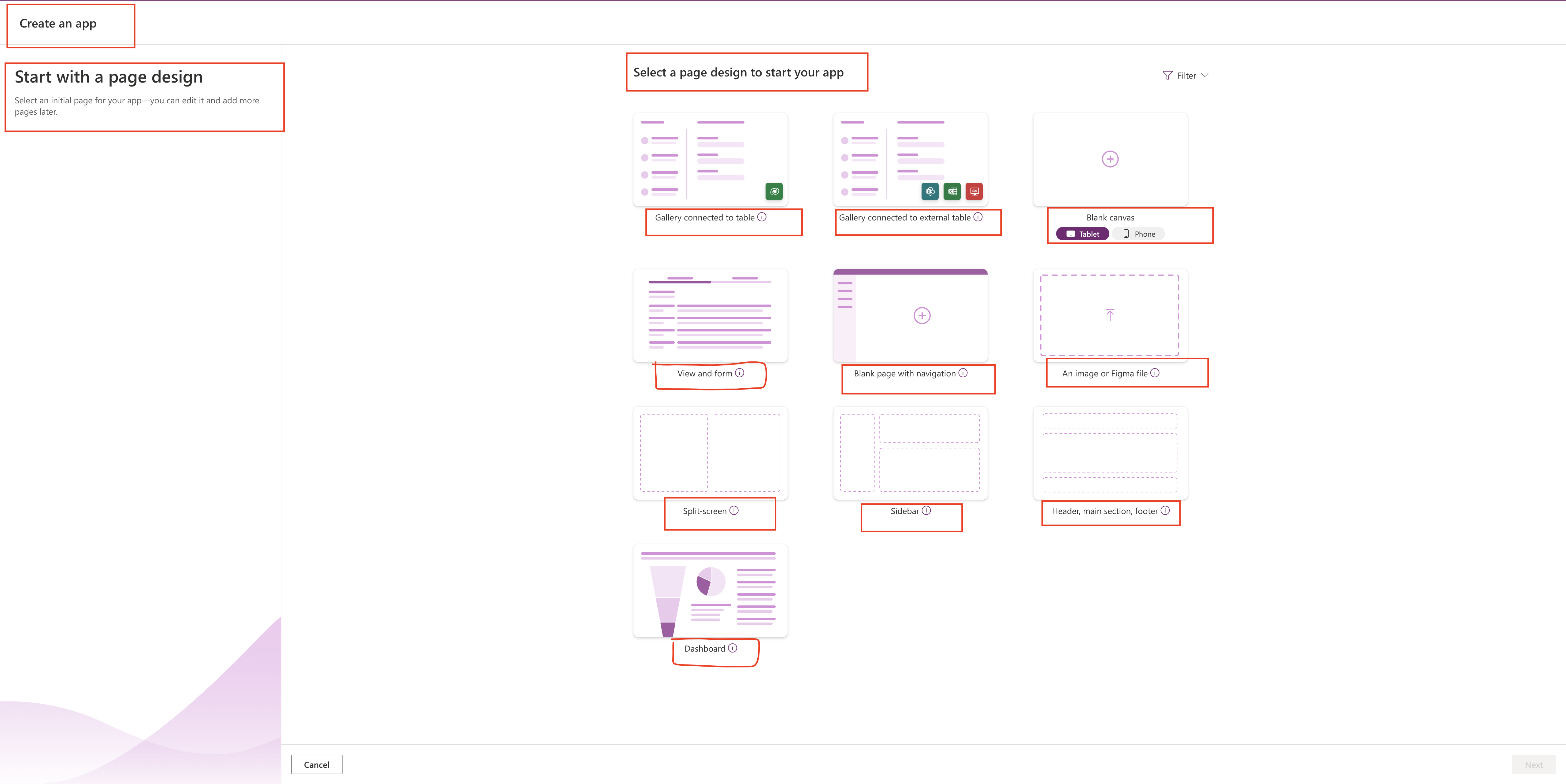
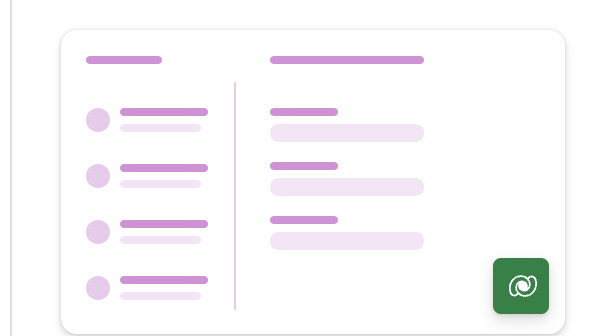
1. Gallery connected to table: See and use your data in a simple, single-page gallery app.

Select this option if
a) You already have business data in Dataverse
b) You want a lightweight, responsive app

Use data from Dataverse Tables.

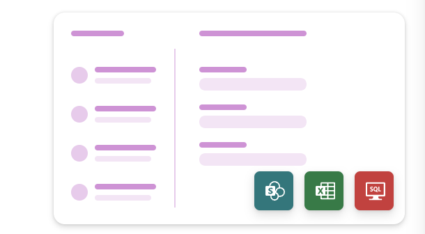
2. Gallery Connected to external table:ee and use your data in a simple, single-page gallery app.


Select this option if
a) You already have business data in Dataverse
b) You want a lightweight, responsive app

Use data from Excel,SharePoint, or SQL.

3. Blank Canvas:

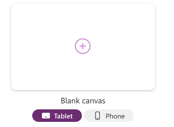
Either Tablet or Phone app.

4. View and form:

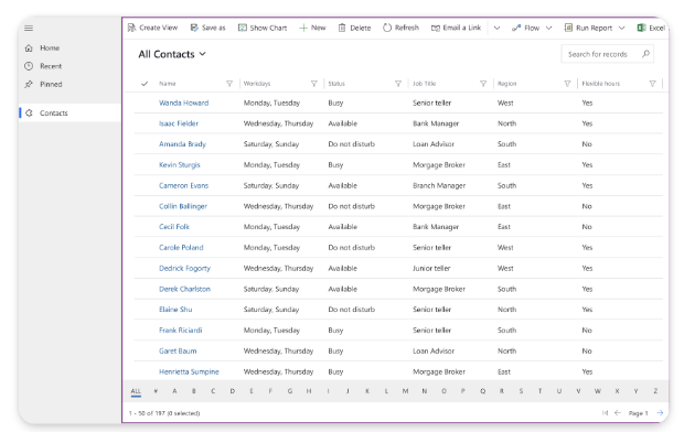
Create a collection of pages that you’ll connect to data.

For each data table you connect, you’ll get
a) One page with up to eight different data views of a table.
b) One Page with a main form for adding and updating table rows.
c) Additional forms that make working with data easier: quick view, quick create, and card forms.

Common uses
Customers building apps for Dynamics 365 frequently use this template.

Uses data from:
Dataverse tables.

5.Blank Page with Navigation:

Build an app on top of data that’s already stored in Dataverse – the smart, secure, and scalable low code data platform.

Select this option if

a) Your app needs to be usable offline
b) Your app needs to handle enterprise scale data

Use data from Dataverse tables.

6. An Image or Figma file:

Upload your app design – either made with our Figma UI KIT, or Saved in any common image file – and we’ll create an app based on that design.

Connect to data:

Once created, connect your app to Dataverse SharePoint, Excel, SQL and more.

7. Split-screen:

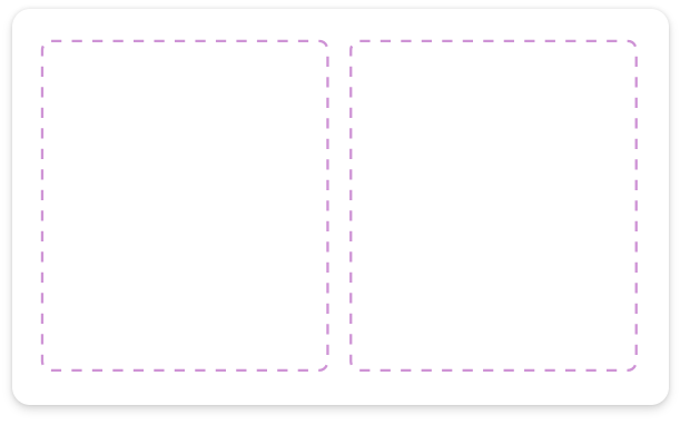
Just add content! This page adapts to different screen sizes, It has two sections, each taking up 50% of the screen width.

Select this option of
a) You want a lightweight responsive app.

Use data from: Once created, connect your app to Dataverse SharePoint, Excel, SQL, and more.
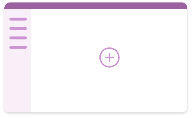
8. Sidebar:

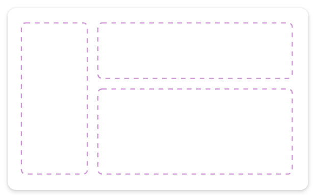
Just add content! This page adapts to different screen sizes.

This Page has
a) A fixed sidebar on the left.
b) A fixed height header section
c) A main section that fills the rest of the screen width

Select this option if
a) You want a lightweight responsive app

Use data from

Once created, Connect your app to Dataverse, SharePoint, Excel, SQL and more.

9. Header, Main Section, Footer:

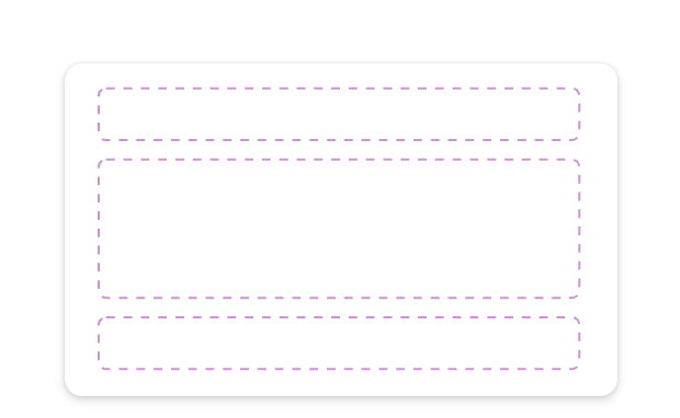
Just add content! This Page adapts to different screen sizes.

This page has
a) A fixed-height header on top.
b) A fixed height footer at the bottom
c) A main section that fills the rest of the screen height.

Select this option if
a) You want a lightweight responsive app

Use data from:

Once created, connect your app to Dataverse, SharePoint, Excel, SQL and more.

10. Dashboard:

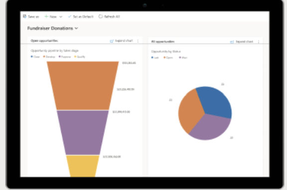
Create an app to visualize data on a single page. Can connect to multiple tables and display multiple charts and graphs.

Use data from: Dataverse tables

Share this:

Elements in Cards Power Apps

Hello Everyone,

Today i am going to share the concept of Cards in Power Apps.

Lets gets started.

Power Apps are mini app and data from dataverse(for now) and we can include the workflow, very interactive, easy to use UI elements, so other applicationw can use as content.

Power Apps cards can add and use business logic through Power Fx, it can integrate with business data through Power Platform Connectors.

We can quickly build the app and share apps without any coding.

How to start creating Cards?

Login into www.make.powerapps.com

On the hand side of the menu click more and you can see the ‘Cards’ and then PIN it to the menu, so that next time you can directly see the Cards on the menu itself.

Click on Cards(Preview)

New Card:

You will be prompted with Card designer UI.

Card designer layout:

Main Menu
Tool Pane
Card Canvas
Card
Property Pane
Formula bar
Play button

Main Menu

We can use this menu to switch between the tools available in the card designer.

Tree View: Hierarchy and view the relationship between the elements

Insert: Add Controls

Data: Add connectors to incorporate data from the external sources.

Variable: Store and reuse data.

Card Canvas and Card:

This is where we can design the cards by adding connectors, variables to your card.

Note: Cards automatically adjust themselves to the location they are placed in and we can’t resize it.

Property Pane:

Property pane to modify an element by editing its properties.

Main properties as follows:

Name
Label or Text
Default value
Initially visible.

We can customize the font color, spacing etc..

Elements have advanced properties such as:

Repeat for every: Trigger whether or when an element should be repeated.
Show when: Trigger when to show the element.
Requires: Make the element dependent on certain features with a corresponding minimum version.

Power Fx expressions can be used in some properties, creating low code solutions that make cards more powerful.

Power Fx editor and Formula bar:

We can use Formula bar to enter the Power Fx expression to automate the process (for example when a button is clicked). So the formula bar even assists you as you’re writing an expression.

Limited Power Fx expressions are working on the cards at the moment, if you need to know click here

Thats it for today.

I hope this helps.
Malla Reddy(@UK365GUY)
#365BlogPostsin365Days

Share this:

New device picker(Preview) for Canvas App

Hello Everyone,

Today i am going to share new preview feature calked new device picker for canvas app.

Lets gets started.

Canvas App can work on desktop and or the mobile too. checking app responsiveness has been a challenge that required you to either resize your web browser window to approximate a mobile device or crack open dev tools to try out certain device sizes.

So now microsoft release new responsive device picker allows to check the look of the app in multiple devices view sizes either it is on the web or table or mobile.

In order to see this feature open your canvas app and click play see below screenshot

Tablets sizes:

When used in combination with auto layout containers or app authoring techniques, we can see how the content of your app will reflow as you switch through the different device types.

Moble sizes:

Final Browser Size:

I hope this helps.

Malla Reddy(@UK365GUY)
#365BlogPostsin365Days

Share this:

Coauthoring in Dynamics 365 Model Driven Apps

Hello Everyone,

Today i am going to show the preview features related to Model Diven App Coauthoring.

What is Coauthoring?

Coauthoring means allowing multiple users either it may be developers, makers or citizen developers to make changes to particular App at the same time.

This will result in cooperation between the development team and maximize low code development.

What you do with Coauthoring in an app?

You can add and remove components like tables, dashboards, and custom pages to and from the model driven app.

Also views, forms, and charts, to and from the tables in model driven app.

You can add and remove areas, groups and subareas to and from the navigation bar in the model driven app.

Change prorperties of the model driven app.

Change properties of the navigation pane.

Change Properties of areas, groups and subareas in the navigation pane, including Display Options and Advanced settings.

Change order of the areas, groups and subareas in the navigation pane.

Change General Features and Upcoming tabs in the settings dialog.

How to enable coauthoring in your environment?

1. Login into PPAC

2. Select the environment and then settings:

3. Enable coauthoring by toggling the button to “ON”

4. Disable coauthoring by toggling the button to “OFF”(If you don’t want to see the coauthoring feature)

How we can check whether someone is working on same tables, or navigation etc..

If the users are making changes to the components, you can see that someone is working on the components.

If someone is adding or removing a page, all other makers can see it appearing on the left navigation bar with sparkle symbol on the navigation bar in real time.

Limitations:

1. There is no auto save functionality, so if someone is making changes they need to save manually by selecting the save button, also you save changes for other users if they haven’t saved the changes.

2. Under Settings, changes to the Features and Upcoming sections must be saved from the dialog in order to be set. Users that don’t see the changes immediately can close and open the settings to see the most up to date settings.

3. Changes made in other designer such as view and form designers won’t be sychronized in real time on the modern app designer.

Thats it for today.

I hope this helps.
Malla Reddy(@UK365GUY)
#365BlogPostsin365Days

Share this: