Hello Everyone,
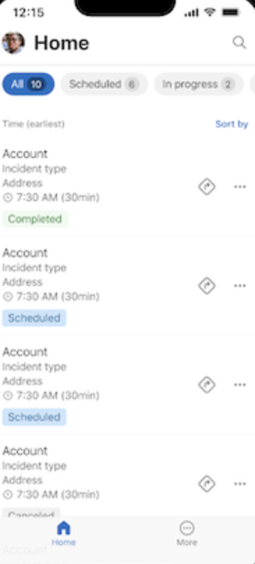
Today I am going to share my thoughts on the new and intuitive user experience for Field Service Mobile.

Let’s get’s started.
The new user experience for Dynamics 365 Field Service mobile includes:
A modern UX with familiar navigation, gestures and controls.
An updated booking form with simplified grids for tasks, products and services.
A refreshed look in the home page, veiws and work order management.
Large touch targets for ease of use and accessibility.
New feature details:
With the new native user experience, users get:
Modern look and feel in the home page, views and other aspects of work order management.
Refreshed user experience bottom navigation bar, left navigation and settings area.
Large touch targets for ease of use and accessibility.
Simplified booking list experience, with the ability to change status with swipe gesture and quickly get directions.
Embedded guides for step by step instruction with embedded pictures and branching flows.
Still have access to the unified interface extensions or customizations made by you in the app through a simple transition experience.

That’s it for today.
I hope this helps.
Malla Reddy Gurram(@UK365GUY)
#365blogpostsin365days
