Hello Everyone,
Today i am going to share new preview feature calked new device picker for canvas app.
Lets gets started.
Canvas App can work on desktop and or the mobile too. checking app responsiveness has been a challenge that required you to either resize your web browser window to approximate a mobile device or crack open dev tools to try out certain device sizes.
So now microsoft release new responsive device picker allows to check the look of the app in multiple devices view sizes either it is on the web or table or mobile.
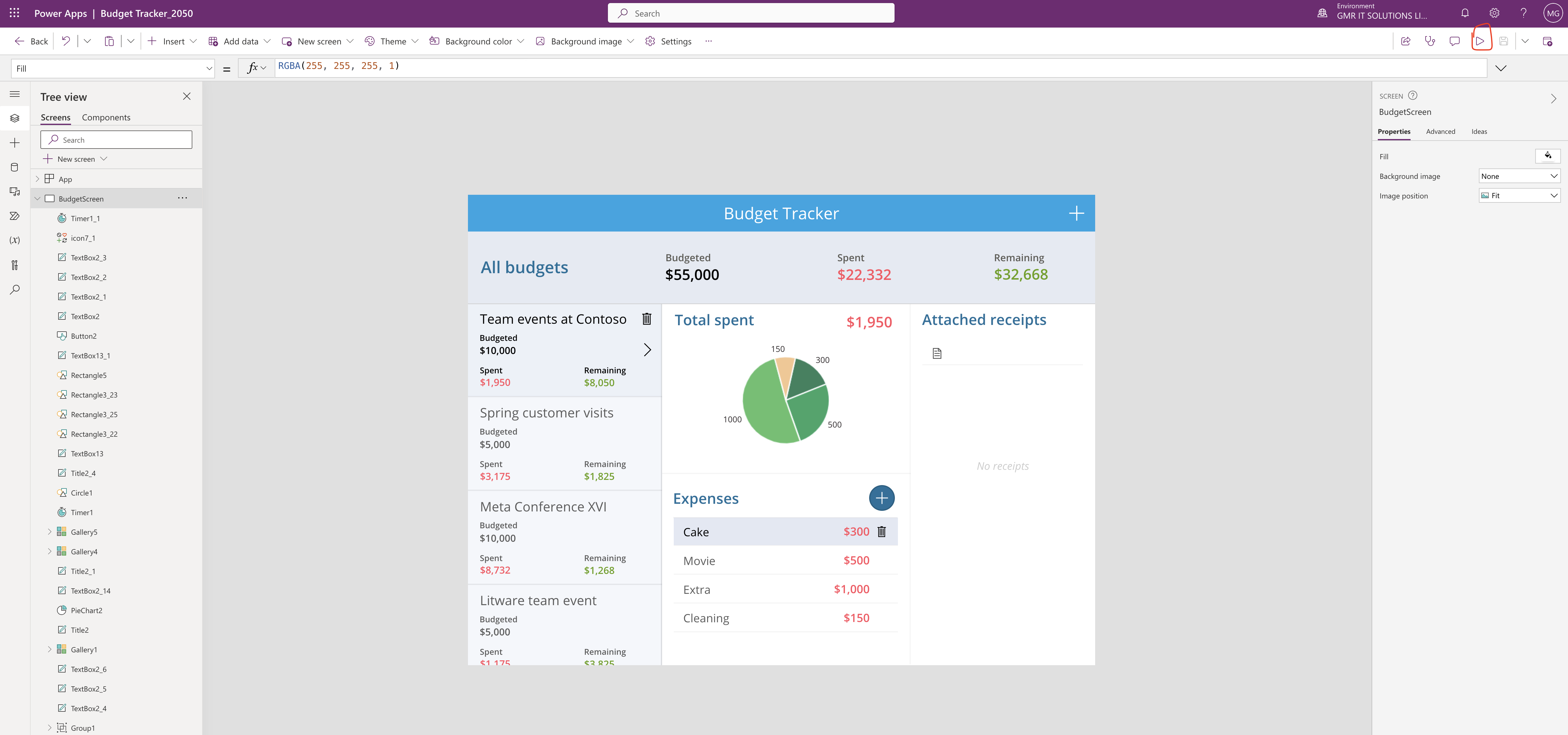
In order to see this feature open your canvas app and click play see below screenshot

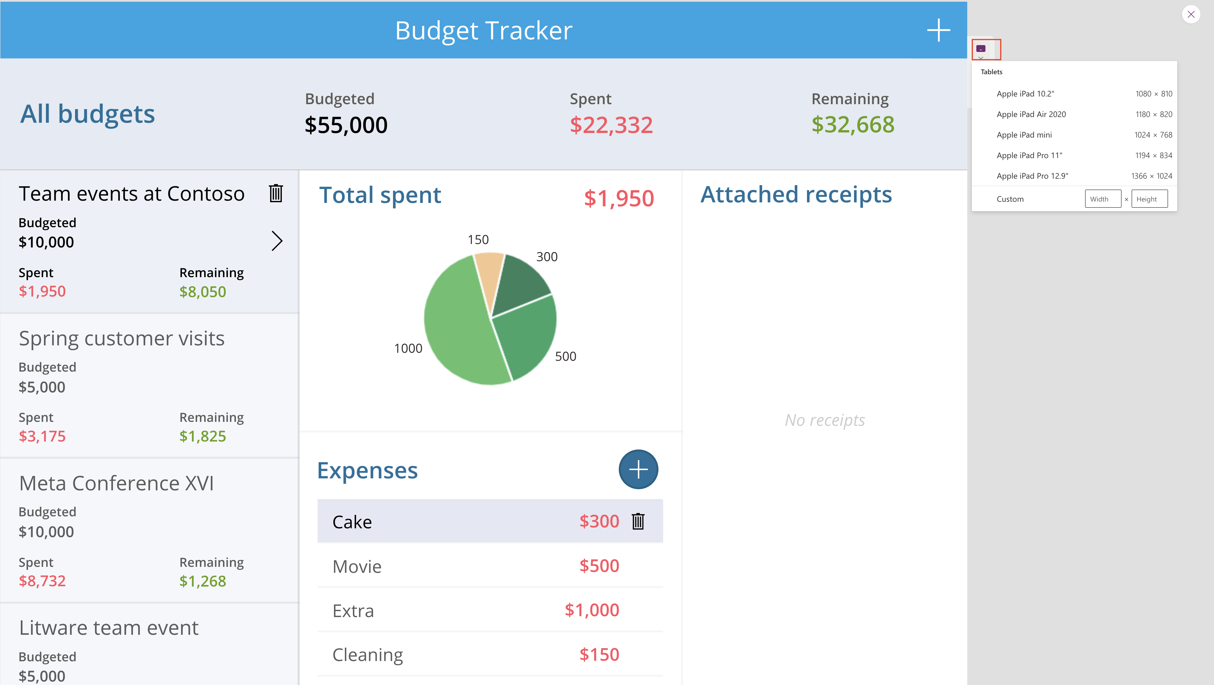
Tablets sizes:

When used in combination with auto layout containers or app authoring techniques, we can see how the content of your app will reflow as you switch through the different device types.
Moble sizes:

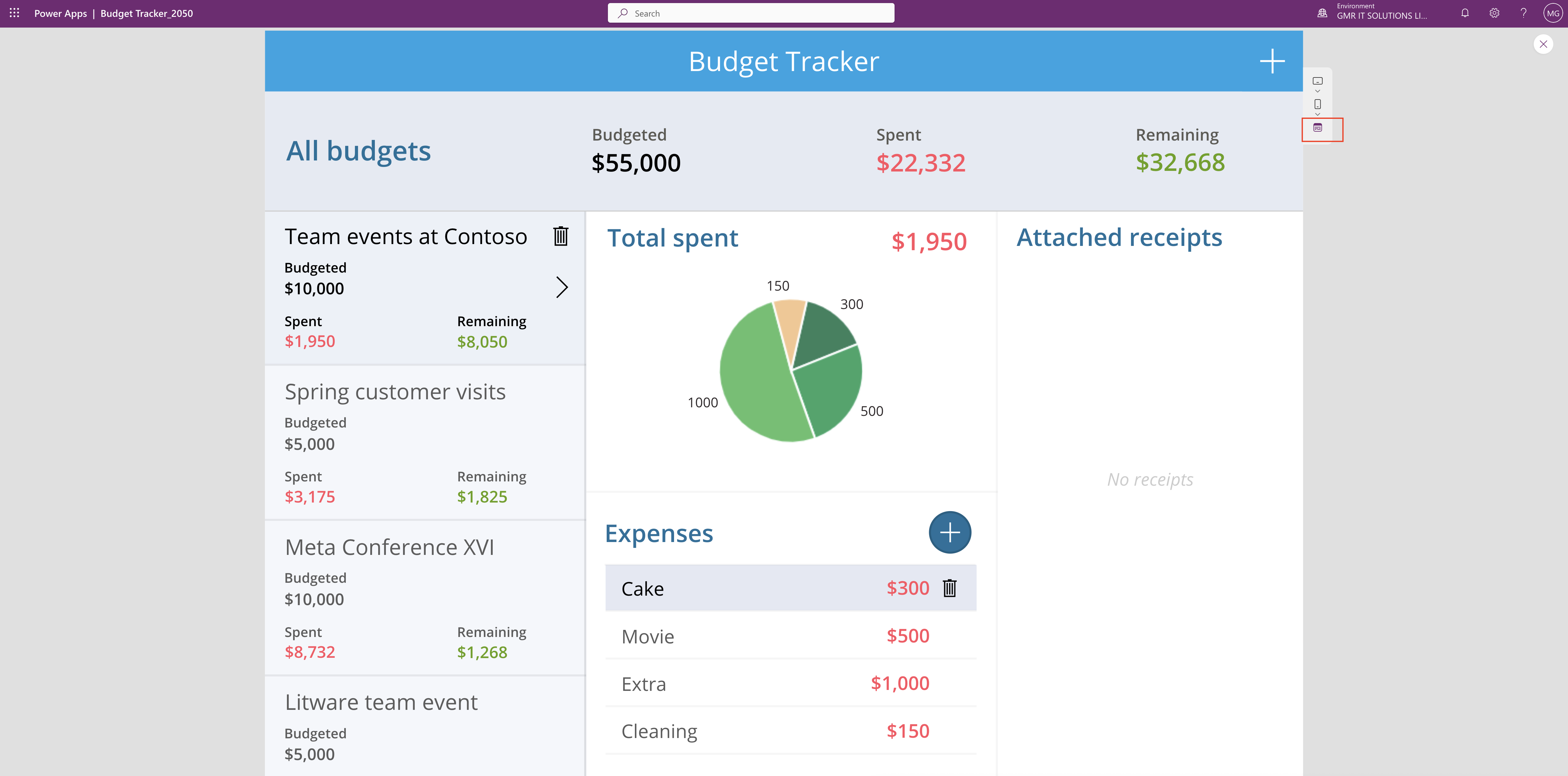
Final Browser Size:

I hope this helps.
Malla Reddy(@UK365GUY)
#365BlogPostsin365Days
