Hello Everyone,
Today i am going to share how we can create Split Screen responsive canvas app what are the configurations we need to do.
Part 8 Series.
Lets gets started.
Login into www.make.powerapps.com

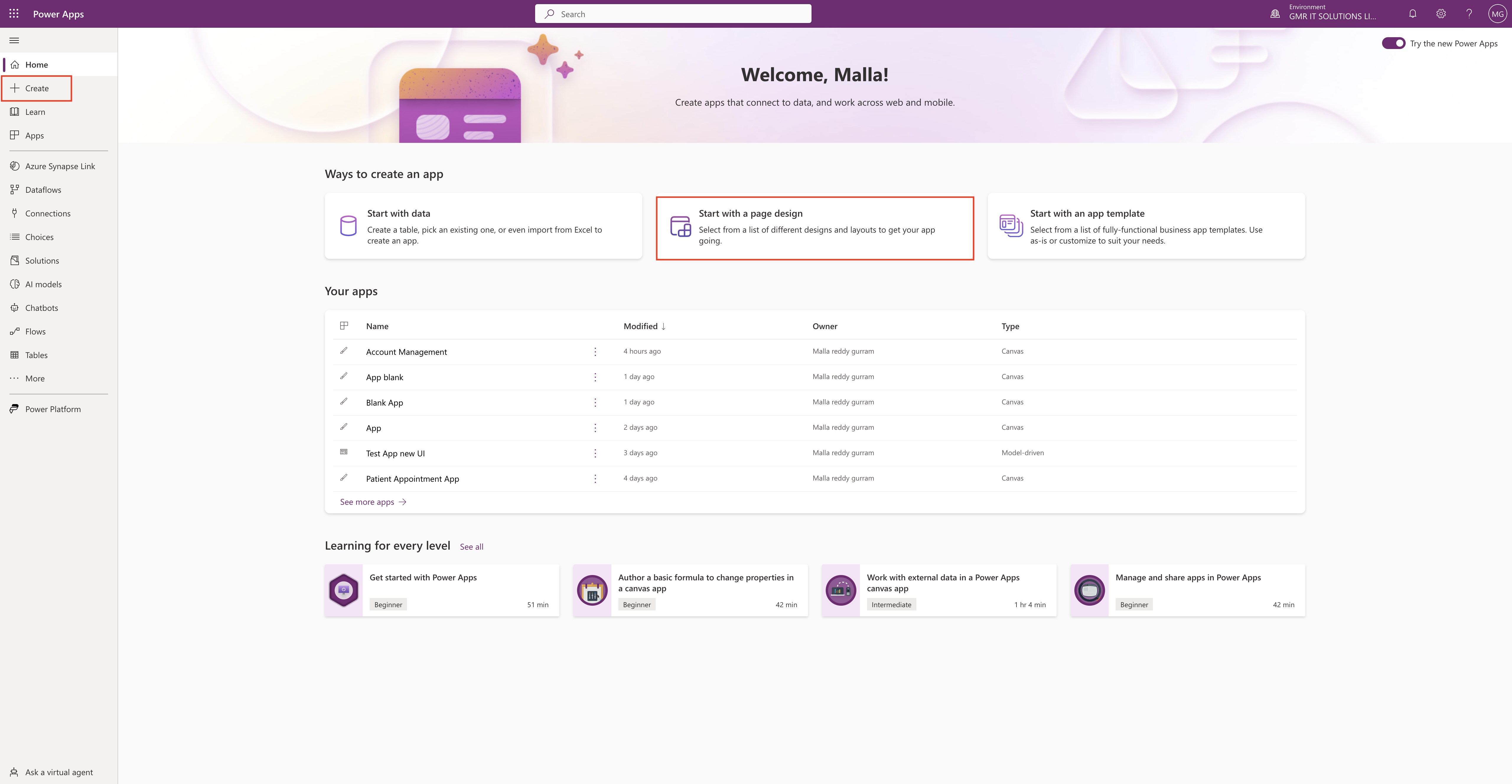
Click on Start with a page design.
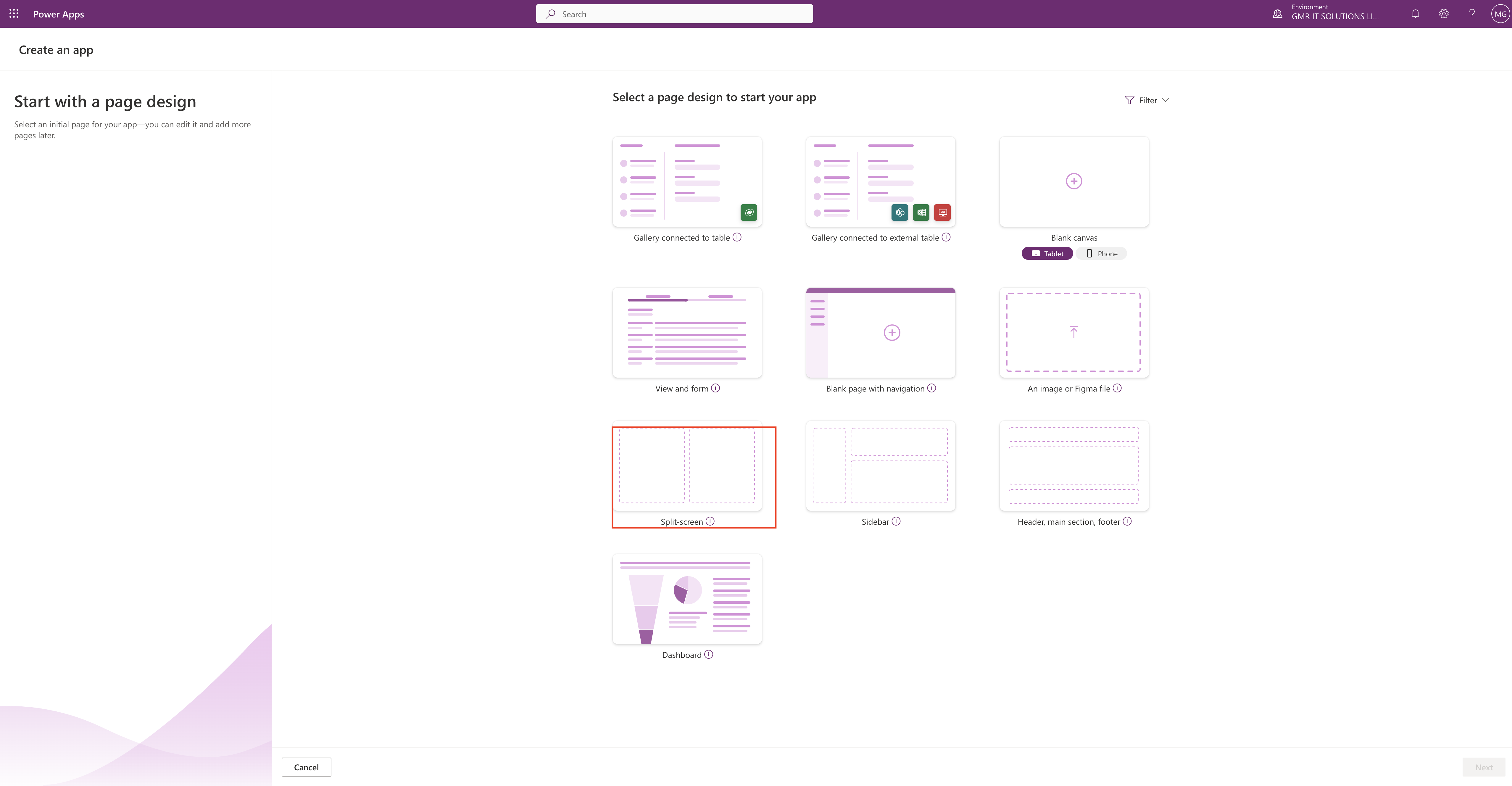
Then on the next screen select the Split-Screen option.
Just add content! This page adapts to different screen sizes. It has two sections, each taking up 50% of the screen width.
Select this option if:
1. You want a lightweight, responsive app.
Uses data from Once created, connect your app to Dataverse, SharePoint, Excel, SQL and more.
Split-Screen:
The Split-Screen has two sections in the layout on the screen, each occupying 50% width of the screen on desktops. On mobile devices, the sections are placed one below other, each occupying up the entire screen width.

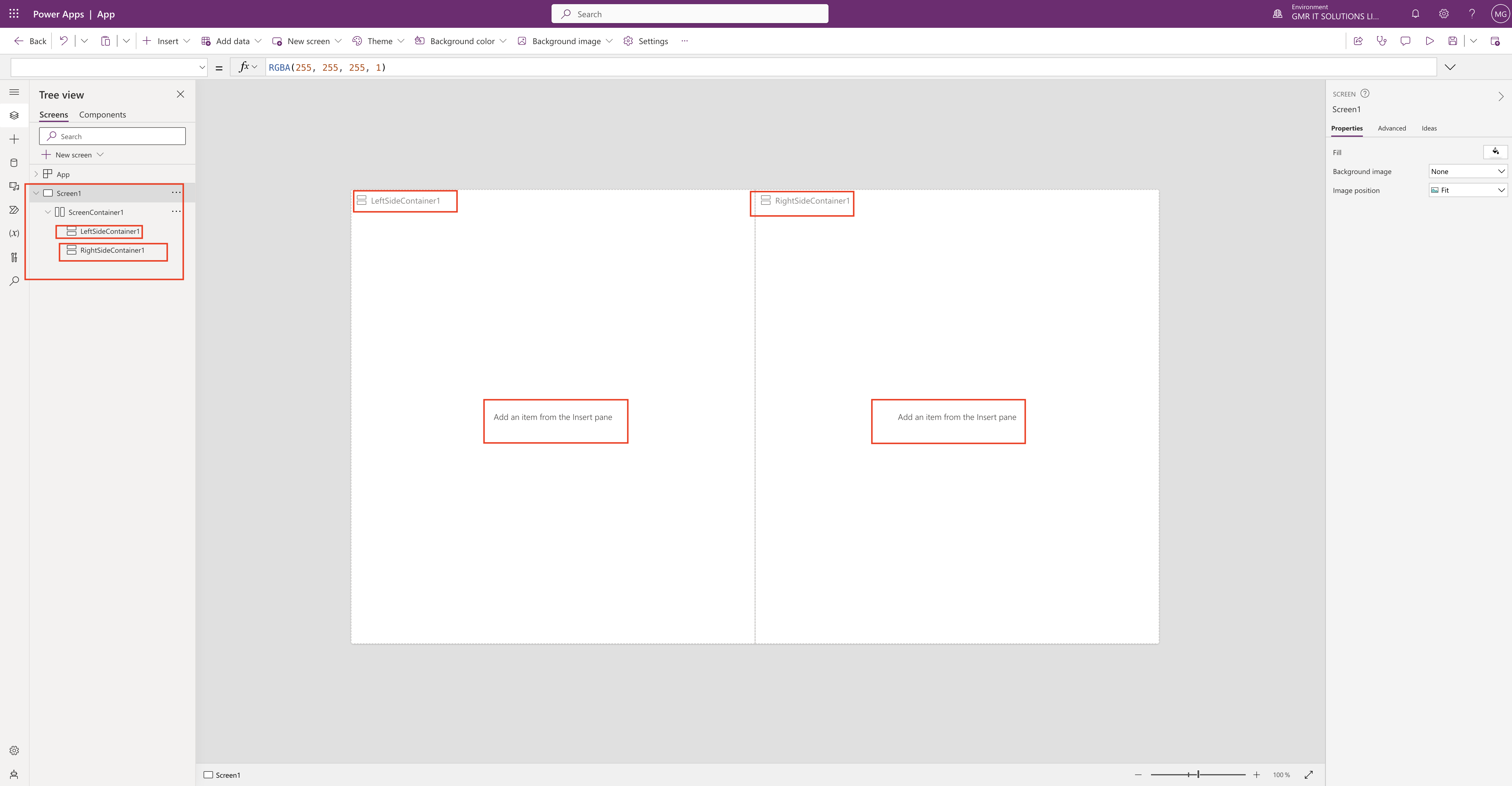
New screen will be displayed with dual screen see below screenshot.

As you can see the screen split into two left side container1 and rightsidecontainer1.
Treeview section Screen1 ScreenContainer1 with LeftSideContainer1 and RightSideContainer1.
You can start designing your canvas app by selecting an Item from the Insert Pane according to your App requirements
For more information about designing the app with responsiveness principles here
I hope this helps.
Malla Reddy(@UK365GUY)
#365BlogPostsin365Days
